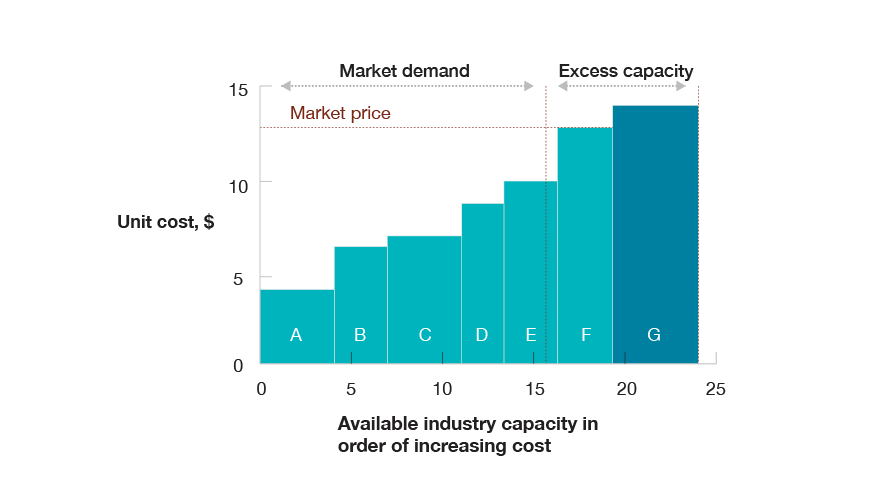
In 1981, Don C. Watters of McKinsey & Company, wrote a staff paper introducing the cost curve as a model for analyzing the strategic decisions about capacity and production that players in heavy, high fixed cost industries have to make towards capacity and production planning. Originally developed in McKinsey’s San Francisco office by Ted Hall and others, the model presented in Watters’ paper, The Industry Cost Curve as a strategic tool, is a classic business analysis tool.
The Model
The Industry Cost Curve[1] is an established instrument of strategic planning, controlling and competitive intelligence. It enables businesses to obtain key insights about the impact of changes in capacity, demand and input costs on market prices and vice versa.
Capacity Changes
It is easy to visualize the impact on supply or demand and quickly get an understanding which plants are competitive under a given scenario. This model also helps guide expansions, consolidations, strategic investments, acquisitions, etc.
Pricing
In a clearly defined (near-)commodity market, you can deduce market price levels from the cost curve. If all players to the left of the demand price their product at the manufacturing cost of the more expensive player, they can secure all market share while pricing competitors out of the market
Competitiveness
An understanding of cost and value drivers helps identify improvement opportunities based on benchmarks, both within an organization and against competitors
Cost Curve
The model displays all market participants by unit costs cost of goods sold in ascending order on Y-axis and cumulated capacities available capacity at a time on the X-axis. The level of demand for a particular product and the unit cost of the capacity of the next supplier determine the market price for that product.

Industry Cost Curve
The producers of a given commodity, in the context of the industrial cost curve the market participants and competitors, are generally willing to supply as long as the price they can obtain exceeds the unit cost of production. The Industry Cost Curve displays all market participants by unit costs [cost of good sold] in ascending order on Y-axis and cumulated capacities [available capacity at a time] on the X-axis.
Under conditions in the broader microeconomic and Industry Cost Curve theory, the level of demand for a product and the unit cost of the capacity of the next available supplier determine the market price.
In theory, firms can use the Industry Cost Curve to predict the impact of changes in capacity, demand shifts and input costs on market prices – and vice versa.
Of particular interest here may be:
- Market price for a given market demand
- Market demand for a given market price
- Structure of the composition of market participants, for example by region, market segment or competitor
- Currency conversions for international use
- Scenario planning to anticipate changes
- Access to low cost or higher grade raw materials
- Access or ownership of key infrastructure
- Access or ownership of proprietary knowledge, hardware, software or patents
- Use of technology in production or extraction processes
- Age and type of machinery used in operations
- Access to financial and human capital
Among other advantages and characteristics the items above can affect the cost curve of your operations and where it is positioned in relation to other competitors.
Case Study – Yellow Writing Pads
In the paper, Watters wrote:
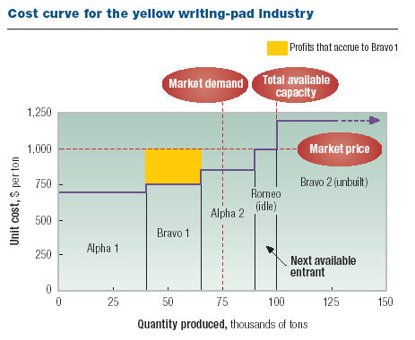
To illustrate the industry cost curve, let us look at the market for yellow writing pads—a product all too familiar to consultants. For a given year, assume that demand is 75,000 tons, regardless of price. Before drawing the cost curve, you should list all existing paper mills, their production capacities, and their per-unit costs as well as any potential new mills or expansions of existing ones. Draw the curve as shown below, starting with the lowest-cost plant at the left and progressing through successively higher-cost facilities. In a well-functioning market, the lowest-cost plant will produce as much as it can, as will the second-lowest-cost plant and so on, until demand is completely satisfied. Any higher-cost plants that are not needed to meet demand will be priced out of the market.
Industry Cost Curve – Yellow Pad
According to the cost curve below, there are currently four paper mills capable of producing yellow notepads: two owned by the Alpha Company, one by the Bravo Company, and one by Romeo Inc. At the moment, Romeo’s $1,000-a-ton mill is mothballed, and Bravo is thinking about building a brand-new facility, Bravo 2, which would have costs of $1,200 a ton. At Alpha’s most efficient mill, called Alpha 1, production costs are $700 a ton. At Bravo 1, they are $750 a ton. And so on. One of the key insights of this exercise is that the market price is set at the cost of the next available entrant over and above those needed to satisfy current demand. For instance, since demand for notepads is 75,000 tons, only three mills are needed to supply the entire market: Alpha 1 running at capacity, Bravo 1 running at capacity, and Alpha 2 producing 10,000 tons of a potential 25,000.
What is the market price? Well, it may bounce around for a while, but it will ultimately settle down at around $1,000. Suppose, for instance, that Alpha were to set the price of its output above $1,000. In that case, the Romeo mill, which is now idle, would enter the market and steal some of Alpha’s sales. But as long as Alpha keeps its prices under $1,000, it doesn’t have to worry about new entrants. In particular, if Alpha sets its price just barely below $1,000—say, at $999—buyers will have to pay that price. Thus, all three mills set their prices at around $1,000, plus or minus a few dollars. The operating profit of each mill is simply quantity x (price-cost), which shows up as the area of a rectangle on the cost curve. The yellow box in the chart, for example, shows the profits that accrue to Bravo 1.
The tricky part is getting the costs right. Let us consider a mill, such as Bravo 2, that hasn’t yet been built. To calculate its costs, begin with the cash cost of producing a ton of notepads and then add the per-unit costs of transporting the pads to their destination (assuming that the supplier does the shipping). Last, include the opportunity cost of the mill: the return on a similarly risky investment the company could make with the money required to build the mill. Opportunity costs are critical: Bravo 2 will not be built if the Bravo Company doesn’t believe that it can at least earn an acceptable return on its capital. What about a mill, such as Bravo 1, that is already built? Most of Bravo 1’s capital costs are sunk: since the money has already been spent, Bravo cannot invest it elsewhere. So the only opportunity cost at Bravo 1 is the cost of the working capital tied up in running the mill. Per-unit costs, then, are equal to the cash costs of production plus transport costs and the opportunity cost of the mill’s working capital.
Just by looking at the cost curve, you can learn some important lessons about manufacturing. For instance, even though Bravo 1 is an efficient producer, the company may not want to expand capacity there. Doing so could drive the higher-cost Alpha 2 out of the market, thus driving the price down, a development that would hurt Bravo 1 more than the additional tonnage sold would help it. 3 Conversely, consider what would happen if a producer such as Alpha were to remove a bit of high-cost capacity from the market —say, by shutting down the Alpha 2 mill. Suddenly, Romeo’s mill would have to enter the market to soak up Alpha 2’s sales. The market price would rise to $1,200— the cost of production at the unbuilt Bravo mill—causing the Alpha 1 mill to earn far higher profits. Thus, from Alpha’s point of view, shutting down Alpha 2 wouldn’t be such a bad idea.
Application
The industry cost curve brings microeconomic rigor to pricing analyses, while still requiring some finesse in teasing out the most powerful insights. Ideally suited to commodity products, it is also applicable where real quantifiable differences in value exist—for example, the length of time for ocean transit. The cost curve’s enduring power is evident in its use in addressing climate change. By plotting the costs of various levers for abating carbon emissions, organizations can identify the most economically viable options. To build a robust cost curve, you require:
- High quality competitive intelligence
- Detailed understanding of underlying cost drivers
- Deep understanding of scale and network effects
- Access to own and competitive data to run plausibility checks
- A solid understanding of market porosity i.e., the definition of market geography and impact of trade
- An educated, dedicated and experienced team for analysis
References
| ↑1 | Enduring Ideas: The industry cost curve |
|---|


