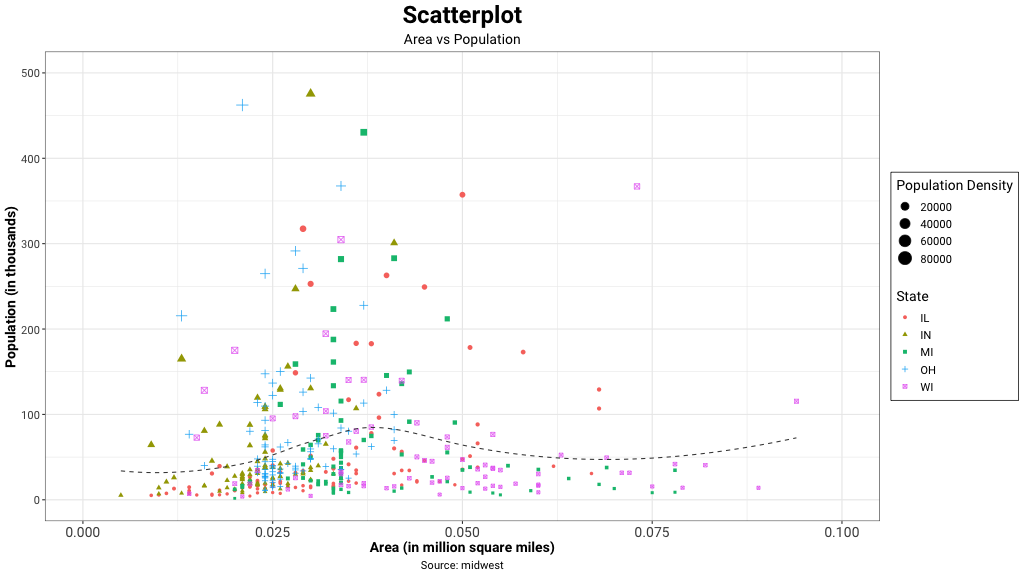
A scatter plot displays the relationship between 2 numeric variables. A correlation coefficient calculation measure the strength of the relationship between the variables. For each data point, plot the value of its first variable on the X axis and the second variable on the Y axis. It is common to provide even more information using colors or shapes (to show groups, or a third variable).
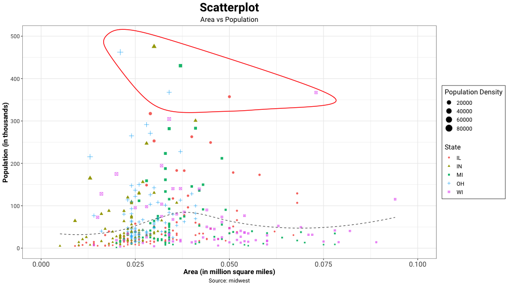
When presenting the results, you could encircle an interesting group of points or region in the plot. Outliers distort the relationship between the variables. Eliminate them, but only if their absence does not affect the analysis of relationship between the two variables. Encircling outliers also helps draw attention to those interesting exceptions / cases. Scatter plots help identify outliers i.e. values that are abnormally distant from most of the data. Eliminating outliers helps improve the visual and inference.
Interpreting scatter plots
Check for negative relationships between the two variables in the plot. If you see low values for the first variable and high values of the second variable, there is a negative correlation. In this case, a line drawn through the data points will slope downwards i.e. a negative slope. Also examine the plot for positive relationship between the variables. If low values for the first variable correspond to low values in the second, and the high values for the first correspond with high values for the second, then the variables have a positive correlation. In this case, a line drawn through the data points will slope upwards. Also inspect the plot for no relationships between the variables. No apparent relationship between the variables if the data points are randomly distributed. In this case, the data points have either no correlation, or small, statistically insignificant correlation.
When to Use Scatter Plots
Scatter plots are used when you want to show the relationship between two variables. A scatter chart works best when comparing large numbers of data points without regard to time. Often, scatter plots will include a trend line to help make the relationship more clear. Additionally, the size, shape or color of the dot could represents a third (or even fourth variable).

