Scatter Plots

Scatter plots, also known as scatter diagrams or scattergrams, are powerful tools for visualizing relationships between two variables in a dataset. These versatile graphs provide a clear and intuitive way to identify patterns, correlations, and outliers within data. By plotting individual data points on a two-dimensional graph, scatter plots allow researchers, analysts, and decision-makers to gain valuable insights into the nature and strength of relationships between different variables.
What is a scatter plot used for?
A scatter plot displays the relationship between two numeric variables, helping identify correlations, clusters, trends, and outliers in a dataset.
How do you identify a positive or negative correlation in a scatter plot?
A positive correlation shows data points rising from lower-left to upper-right. A negative correlation shows points descending from upper-left to lower-right.
Can scatter plots show more than two variables?
Yes. Additional variables can be represented using different colors, shapes, or sizes for the data points, adding further dimensions to the visualization.
What are outliers in a scatter plot and how should they be handled?
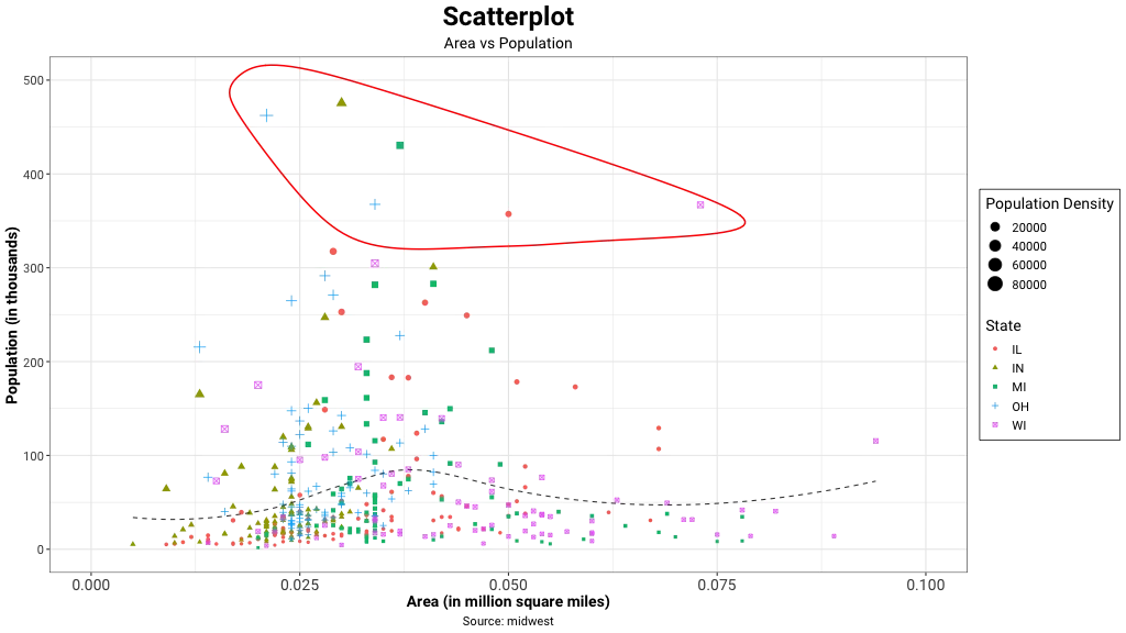
Outliers are points significantly distant from the main data cluster. They can be encircled to draw attention or removed if their absence does not affect the analysis of the relationship.
When is a scatter plot the best chart choice?
Scatter plots work best when comparing large numbers of data points across two numeric variables, especially when time is not a factor and a trend line may help clarify the relationship.
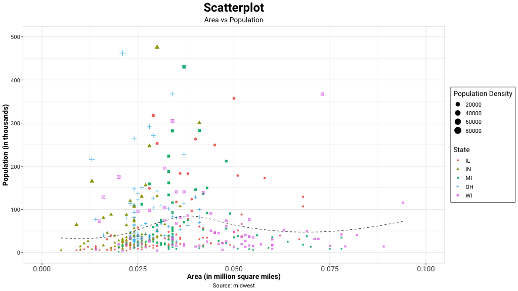
At its core, a scatter plot consists of a horizontal axis (x-axis) and a vertical axis (y-axis), each representing a different variable. Each data point in the dataset is represented by a dot or marker on the graph, with its position determined by the values of the two variables being examined. This simple yet effective visualization technique allows for the quick identification of trends, clusters, and anomalies within the data.
Dimensions
A scatter plot displays the relationship between 2 numeric variables. A correlation coefficient calculation measure the strength of the relationship between the variables. For each data point, plot the value of its first variable on the X axis and the second variable on the Y axis. It is common to provide even more information using colors or shapes (to show groups, or a third variable).
Strengths
One of the primary strengths of scatter plots lies in their ability to reveal the type and strength of relationships between variables. A positive correlation is indicated when the data points form a pattern that rises from the lower left to the upper right of the graph, suggesting that as one variable increases, the other tends to increase as well. Conversely, a negative correlation is shown by a pattern that descends from the upper left to the lower right, indicating that as one variable increases, the other tends to decrease. The tightness of the pattern around a straight line or curve indicates the strength of the correlation, with a tighter grouping suggesting a stronger relationship.
Scatter plots are not limited to showing linear relationships. They can also reveal non-linear patterns, such as exponential or logarithmic relationships, which might not be immediately apparent in other forms of data representation. This makes scatter plots particularly valuable in fields where complex relationships between variables are common, such as in scientific research, economics, and social sciences.
In addition to revealing correlations, scatter plots are excellent for identifying outliers in a dataset. Outliers appear as points that are significantly distant from the main cluster of data points. These outliers can be important in many analyses, as they may represent errors in data collection, exceptional cases that warrant further investigation, or indicators of underlying phenomena that are not captured by the main trend in the data.
When presenting the results, you could encircle an interesting group of points or region in the plot. Outliers distort the relationship between the variables. Eliminate them, but only if their absence does not affect the analysis of relationship between the two variables. Encircling outliers also helps draw attention to those interesting exceptions / cases. Scatter plots help identify outliers i.e. values that are abnormally distant from most of the data. Eliminating outliers helps improve the visual and inference.
Interpreting scatter plots
Versatility
The versatility of scatter plots extends to their ability to incorporate additional dimensions of data beyond the two primary variables. This can be achieved through the use of different colors, shapes, or sizes for the data points, each representing an additional variable or category within the dataset. For example, in a scatter plot showing the relationship between a person's height and weight, different colors could be used to represent gender, adding another layer of information to the visualization.
When to Use Scatter Plots
Scatter plots are used when you want to show the relationship between two variables. A scatter chart works best when comparing large numbers of data points without regard to time. Often, scatter plots will include a trend line to help make the relationship more clear. Additionally, the size, shape or color of the dot could represents a third (or even fourth variable).
Scatter plots are a fundamental and versatile tool in data visualization and analysis. Their ability to clearly display relationships between variables, reveal patterns and outliers, and accommodate additional dimensions of data makes them invaluable across a wide range of disciplines. From basic research to complex data science applications, scatter plots continue to play a crucial role in helping us understand and interpret the vast amounts of data generated in our modern world. By providing a visual representation of data relationships, scatter plots bridge the gap between raw numbers and meaningful insights, enabling more informed decision-making and deeper understanding of complex phenomena. As data visualization techniques continue to evolve, scatter plots remain a cornerstone of effective data communication, adapting to new technologies and methodologies while maintaining their core strength of clearly representing relationships within data.
Citation
Cite this article
Sridharan, M. A. (2017, August 22). Scatter Plots. Think Insights. https://thinkinsights.net/dna/scatter-plots (Accessed [[ACCESS_DATE]])
Sridharan, Mithun A. "Scatter Plots." Think Insights, 22 Aug. 2017, https://thinkinsights.net/dna/scatter-plots. Accessed [[ACCESS_DATE]].
Mithun A. Sridharan, "Scatter Plots," Think Insights, August 22, 2017, https://thinkinsights.net/dna/scatter-plots. Accessed [[ACCESS_DATE]].
Sridharan, M.A. (2017) 'Scatter Plots', Think Insights. Available at: https://thinkinsights.net/dna/scatter-plots (Accessed: [[ACCESS_DATE]]).
M. A. Sridharan, "Scatter Plots," Think Insights, 2017. [Online]. Available: https://thinkinsights.net/dna/scatter-plots. [Accessed: [[ACCESS_DATE]]].
Sridharan MA. Scatter Plots. Think Insights. Published August 22, 2017. Accessed [[ACCESS_DATE]]. https://thinkinsights.net/dna/scatter-plots
Test Your Knowledge
Scatter Plots
Challenge yourself on the concepts from this article and see how well you understood them.
Subscribers get weekly quizzes and insights — subscribe free
Sponsor this article
Partner with Think Insights
Reach 50,000+ business leaders, consultants, and strategists. Feature your brand alongside expert articles on strategy, leadership, and digital transformation.
Become a Sponsor