Bump Chart

- A Bump Chart is a special form of a line plot designed for exploring changes in rank over time
- This chart helps compare the position / performance / ranking of multiple observations rather than the actual values itself
What is a Bump Chart?
A Bump Chart is a special form of line plot that displays rank over time rather than actual values, making it easy to compare relative positions of multiple observations.
What does a crossing line indicate in a Bump Chart?
When two lines cross, it indicates a change in rank, meaning one entity has surpassed another in absolute terms even though the comparison is based on relative ranks.
When should you use a Bump Chart instead of a line chart?
Use a Bump Chart when rank is the primary concern. If actual or relative magnitudes matter more, a line or area chart is more appropriate. If both matter, consider a sized bump chart.
Where does the name 'Bump Chart' come from?
The name originates from boat racing, where each boat attempts to bump another and move up in standings.
What are practical use cases for Bump Charts?
Bump Charts can visualise changes in rankings across dimensions, including social media data to identify trending topics or tracking performance standings over time.
A Bump Chart is a special form of a line plot. This chart is well-suited for exploring changes in rank over time. Using this chart, you can easily compare the position, performance or rankings of multiple observations with respect to each other rather than the actual values itself.
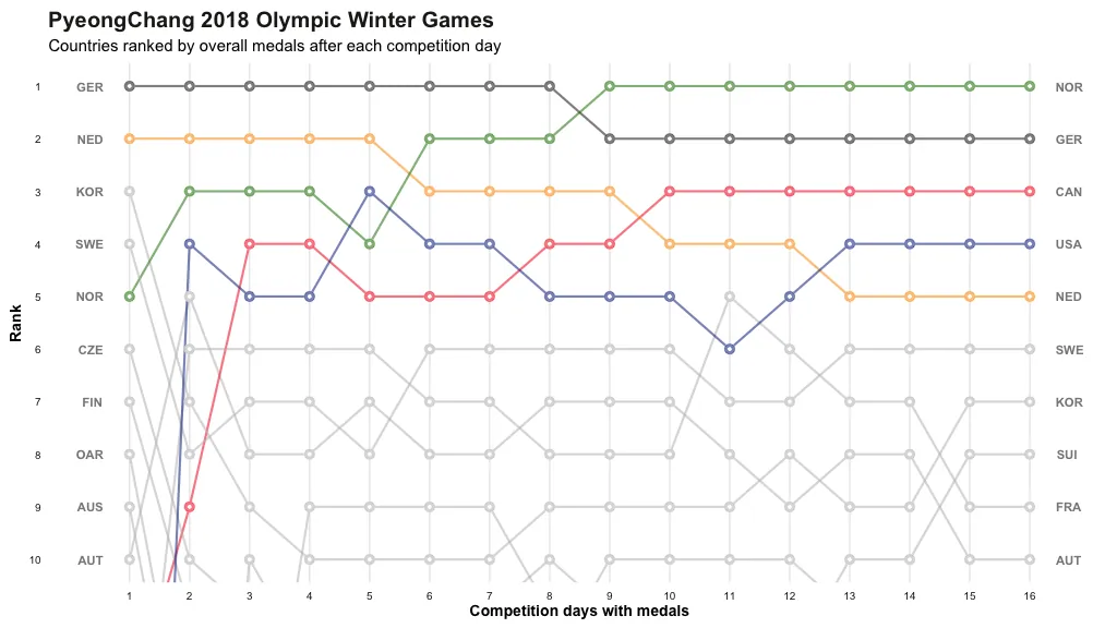
These charts are relatively similar to line charts. However, instead of plotting some measures on the y-axis, these charts show the rank. Bump charts have been around for a while, but recently there is an increased interest in these charts. The name originated from a boat race where each boat tries to bump their boat and move up in their respective standing. Bump charts are very useful to compactly highlight trends.
Interpreting a Bump Chart
When a line crosses another line, that is indicative of a change in rank. In other words, a crisscross in a bump chart indicates one entity has surpassed other in absolute terms even when comparison is based on relative ranks. Rank is a powerful feature for any visualization. It is very effective to understand how each of the categorical members perform against the same measure.
When to use this chart?
Ultimately, you could use Bump charts to communicate changes in ranks amongst your dimensions. Likewise, if you wish to show the magnitude and relationships among your dimensions, you can use these charts. If rank is very important, then a Bump chart is the better option. However, if actual and relative magnitudes are more important, then you are better off with a different type of visualisation, such as a line or area chart. In situations where both are important, a sized bump chart is better suited. In practise, you can use a Bump chart can be used to visualise data from social media sources to identify trending topics.
Credits
The source code from R-Bloggers was used to create the visualisation.
- Bump charts help communicate changes in ranks amongst dimensions
- Bump charts can be used to show the changes in magnitude and relationships among your dimensions
Citation
Cite this article
Sridharan, M. A. (2018, August 7). Bump Chart. Think Insights. https://thinkinsights.net/dna/bump-chart (Accessed [[ACCESS_DATE]])
Sridharan, Mithun A. "Bump Chart." Think Insights, 7 Aug. 2018, https://thinkinsights.net/dna/bump-chart. Accessed [[ACCESS_DATE]].
Mithun A. Sridharan, "Bump Chart," Think Insights, August 7, 2018, https://thinkinsights.net/dna/bump-chart. Accessed [[ACCESS_DATE]].
Sridharan, M.A. (2018) 'Bump Chart', Think Insights. Available at: https://thinkinsights.net/dna/bump-chart (Accessed: [[ACCESS_DATE]]).
M. A. Sridharan, "Bump Chart," Think Insights, 2018. [Online]. Available: https://thinkinsights.net/dna/bump-chart. [Accessed: [[ACCESS_DATE]]].
Sridharan MA. Bump Chart. Think Insights. Published August 7, 2018. Accessed [[ACCESS_DATE]]. https://thinkinsights.net/dna/bump-chart
Test Your Knowledge
Bump Chart
Challenge yourself on the concepts from this article and see how well you understood them.
Subscribers get weekly quizzes and insights — subscribe free
Sponsor this article
Partner with Think Insights
Reach 50,000+ business leaders, consultants, and strategists. Feature your brand alongside expert articles on strategy, leadership, and digital transformation.
Become a Sponsor