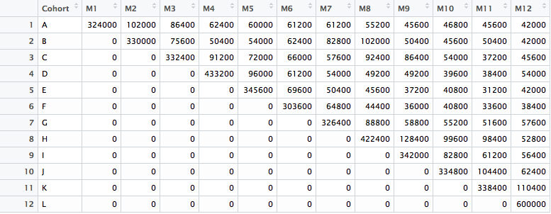
The goal of any business analytic tool is to analyze and present actionable information to a company to act on. To achieve this objective, the insights must be relevant to the situation at hand. A database with thousands or millions of entries make it compelling. Yet, despite the comprehensiveness, it’s tough to gain actionable data, as those data span many different categories and time periods.
Cohort analysis
Actionable cohort analysis allows for the ability to drill down to the users of each specific cohort to gain a better understanding of their behaviors, such as if users checked out, and how much did they pay. In cohort analysis, each new group [cohort] provides the opportunity to start with a fresh set of users, allowing the company to look at only the data that is relevant to the current query and act on it.
Cohort Analysis is one of the most powerful and demanded techniques available to marketers for assessing long-term trends in customer retention and calculating life-time value. Cohort analysis helps you understand the behavior of component groups of users apart from your user population as a whole. The distinctive “layer-cake graph” produced by looking at cohorts in calendar time can provide powerful insights into the health of your business.
Layer-cake Graph
At a given point in time, what percentage of your revenue or profit came from new vs. repeat customers? Tracking how that ratio has changed over time can give you insight into whether you’re fueling top-line growth solely through new customer acquisition – or whether you’re continuing to nurture those relationships with your existing customers over time.
R code
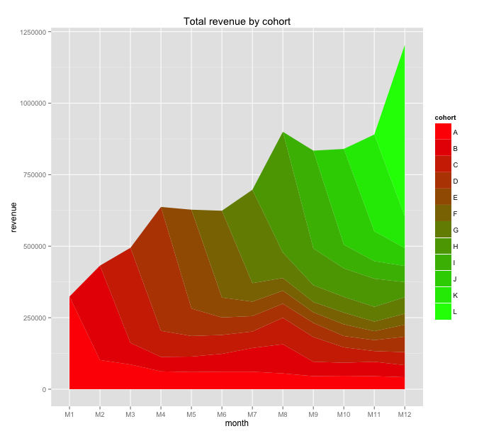
The above R code produced the following layer cake graph, which permits visual analysis:
Interpretation
From the graph, you could observe that monthly revenue is highly dependent on new customers who did their first purchases. However, during the time, the company accumulated several layers of income from existing (loyal) customers and reduced dependence. Further, it seems like there was some activity (e.g. promo) in the eighth month (M8) and a few cohorts responded. Layer cake graphs help visually analyse seemingly complex layers of data and understand the behavioural underpinnings of marketing campaigns.


